Sleep Cycle Graph and Chart: What a Sleep Graph Shows?
A sleep cycle graph shows the shape of your night — how you rise and fall through light, deep, and REM sleep, over and over, in roughly 90-minute waves. Seeing that shape is what makes good sleep timing click: once you can picture where the deep dips and the light peaks fall, it’s obvious why waking at the top of a wave feels easy and waking in a trough feels rough. This page is about reading that picture. For the exact clock times to go with it, use the bedtime chart.
What a Sleep Cycle Graph Shows?
Plot sleep with time running left to right and depth running top to bottom, and you don’t get a flat line — you get a wave. You drop quickly into deep sleep early on, rise back toward the surface, dip again, and repeat. That repeating rise-and-fall is the graph, and each full wave is one sleep cycle of about 90 minutes.
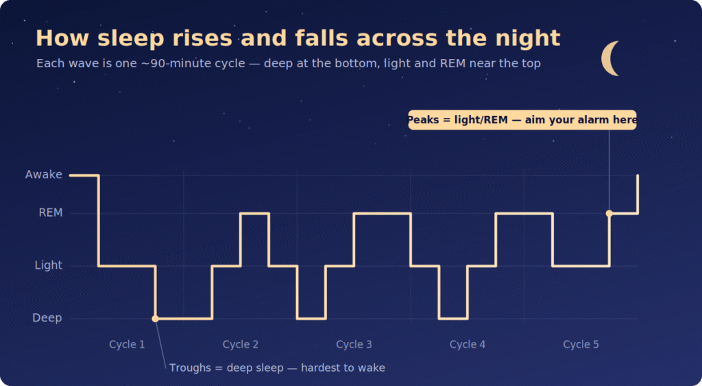
The shape carries one practical message: sleep isn’t uniform. The bottom of a wave (deep sleep) is the hardest place to be woken from; the top of a wave (light sleep, and the edge of REM) is the easiest place. Your whole goal in timing an alarm is to land it on a peak, not in a trough.
The Shape of One Cycle
Zoom into a single 90-minute wave, and it moves through four phases before resetting:
| Phase in the cycle | Roughly how long | Where it sits on the graph |
|---|---|---|
| Light (drifting off) | ~5 min | The downslope at the start |
| Settling in | ~25 min | Continuing down |
| Deep | ~40 min | The bottom of the wave |
| REM (active-brain) | ~20 min | Rising back to the surface |
The exact split shifts a little from cycle to cycle, but the wave always ends near the surface, which is the natural break point between one cycle and the next.
How Does the Graph Change Across the Night?
The single most useful thing a sleep cycle graph reveals is that the waves aren’t identical. Early in the night, the troughs are deepest — that’s when most of your deep sleep happens. As the night goes on, the troughs get shallower, and the REM stretches near the surface get longer.
That’s why the graph slopes differently at 2 AM than at 6 AM:
- First half of the night: deep troughs, short surface time. Waking here feels heaviest.
- Second half of the night: shallow troughs, long surface stretches. Waking here feels easiest.
It’s also why cutting the morning short is an uneven trade — the later waves you skip are the light, REM-heavy ones that would have made waking up easy.
Reading the Graph to Time Your Alarm
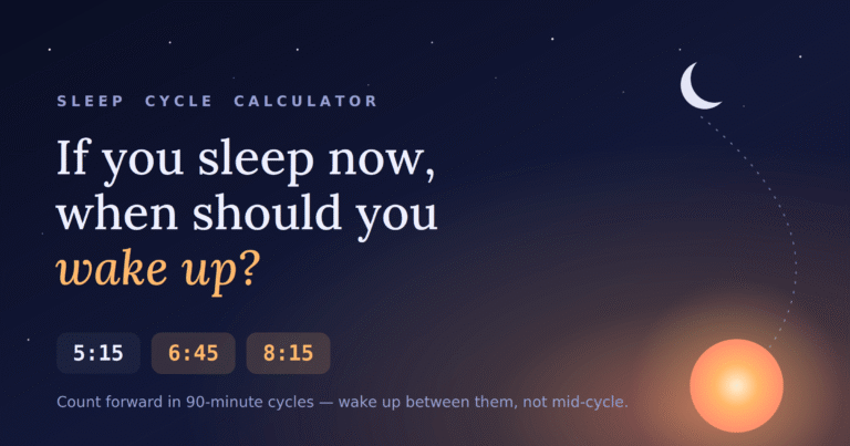
Put it together, and the timing rule falls out of the picture: aim your alarm at a peak between waves, not at a trough. Because each wave is about 90 minutes, the peaks land at roughly 90-minute intervals from when you fall asleep — 1.5, 3, 4.5, 6, 7.5, and 9 hours in.
| Cycles | Total sleep | Where it lands on the graph |
|---|---|---|
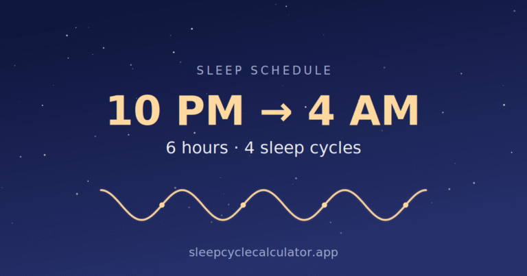
| 4 cycles | 6 hours | End of the 4th wave |
| 5 cycles | 7.5 hours | End of the 5th wave |
| 6 cycles | 9 hours | End of the 6th wave |
A flat 8 hours, by contrast, drops you partway up the 6th wave — close to a peak but not on it, which is why 7.5 or 9 hours often feels cleaner than 8. To turn these peaks into real clock times, the bedtime chart lists them out, and the sleep cycle calculator draws the line straight to your wake-up time.
Common Questions About Sleep Cycle Graph
What does a sleep cycle graph actually plot? Time along the bottom and sleep depth up the side. The result is a repeating wave — deep sleep at the troughs, light and REM sleep near the peaks — with one full wave per ~90-minute cycle.
Why do the waves get shallower toward morning? The mix inside each cycle shifts as the night goes on: deep sleep shrinks, and REM grows. So later waves spend more time near the surface, which is why a morning wake-up tends to feel easier than a 3 AM one.
Where on the graph is the best time to wake up? At a peak — the light stretch between two waves. That’s the surface point your body is already closest to waking from, so it feels smooth instead of groggy.
Is the 90-minute wave exact? It’s an average. Real waves run roughly 80 to 100 minutes and vary a little through the night, but 90 minutes is close enough to plan your peaks around.
Conclusion
A sleep cycle graph is just a wave: down into deep sleep, back up to the surface, repeated four to six times a night, with the troughs flattening and the REM peaks lengthening toward morning. Once you can see that shape, the whole point of cycle timing is obvious — set your alarm for a peak between waves, around a 90-minute multiple from when you fall asleep, and you wake up on the easy part of the curve instead of being dragged out of a trough.
Picture the wave, aim for a peak, and let the bedtime chart or the calculator handle the exact minutes.